
Pantone’s 2014 Color of the Year: “Dazzling Blue”
It’s that time of the year when futurists, trend spotters, demographers, forecasters and others start looking at the upcoming new year in earnest and making predictions about what we will be wearing, eating, decorating, computing, driving and in general, how we will be living. One of the most recent predictions has been what the color of the year will be in 2014. And it is shades of blue.
Blue is the color of trust – which during a time of economic and social unrest makes it an especially attractive hue. Both Pantone and Benjamin Moore have picked shades of blue as the number one color for 2014. Not surprisingly, Pantone’s “Dazzling Blue” is basically the same color as Facebook’s signature blue. (Did you know that Mark Zuckerberg actually chose to make Facebook blue for a very specific reason: he can see it. He is red-green colorblind, so he chose blue for Facebook. “Blue is the richest color for me. I can see all of blue,” he told The New Yorker in 2010.)

Benjamin Moore’s 2014 Color of the Year: “Breath of Fresh Air”
Benjamin Moore also recently unveiled its Color of the Year for 2014, which is “Breath of Fresh Air” (color number 806). Breath of Fresh Air is a very soft, calm, light blue serving as a “new neutral.” Benjamin Moore said in its announcement that they chose Breath of Fresh Air and the rest of its Color Trends 2014 palette as a direct result of the fresh color cues and pastel trends they’ve seen throughout the home furnishing, fashion and pop culture landscape.
Shades of blue are also in the mix in the car-color market: From Chevy’s Sonic “Cool Blue” and Spark’s “Denim” (bright light blue), to the Ford Mustang’s intense shade of drier “Grabber Blue” on the Boss 302, these blues are designed to draw the eye, particularly among the mostly bland colors offered on most North American vehicles.
Source: The Logo Company
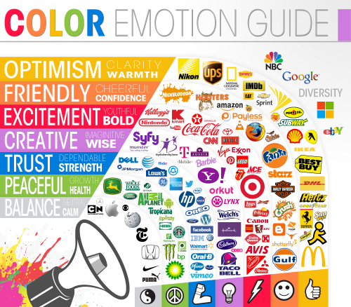
In addition to being the color of trust, blue reflects competence, dependability and strength. But of course there are broader messaging patterns to be found in color perceptions. In the Psychology of Color in Marketing and Branding, it is noted that colors play a fairly substantial role in purchases and branding, and that up to 90% of snap judgments made about products “can be based on color alone.”
And in terms of the role that color plays in branding, research shows that the relationship between brands and color hinges on the perceived appropriateness of the color being used for the particular brand. Colors influence how consumers view the “personality” of a brand.
It’s convenient for 2014’s color of the year that everyone likes blue. Pantone’s 2013 color of the year was Emerald Green, and Benjamin Moore’s was Lemon Sorbet. Both of their 2014 colors should prove to be more popular since blue is the most popular color in the world, with an overall 40% of people liking it the best, and 42% of Americans picking blue as their top color. It’s a long way to the second most favorite color – purple – which was chosen by only 14% worldwide.
While men prefer blue over women, it still ranks #1 for both genders. In a 2003 worldwide study, 57% of male participants prefer blue, and 35% of women picked the color as their favorite. In another study done in 2007, an experiment was done how men and women differ in their perception of color. The experiment showed that men and women both preferred blue out of the set of colors surveyed. But when asked to choose from mixed colors, women liked colors that are closer to the red end of the spectrum, where shades of pink are found.
![]()
Blue is now the most popular color on the Internet, and in addition to Facebook, is the primary color for corporate logos for the likes of LinkedIn, Twitter, Wikipedia, Digg, Bing, MySpace, Flickr and many more. It’s also the logo color for many Fortune 500 companies from AT&T to Ford, from GE to IBM, from Intel to American Express.
But again, the reason blue has been selected for 2014 as the color of the year isn’t because of its popularity, but because it’s a calming color, that reflects tranquility and peacefulness. It is friendly, approachable and relaxing. It’s a bit nostalgic, yet can symbolize unlimited thinking and innovation. It’s a day at the beach, with a clear blue sky above. It’s a good choice, we could all use a little blue.


[…] drei am häufigsten verwendeten Logofarben. Quelle: SJ Insights, […]